I get asked a lot about my brand – Blooming From Within. It has a story, and everything I do is aligned to it. It’s both my motto, my catch cry. It serves as my constant intention and affirmation. My brand and business name are both one and the same. The logo of my business serves the purpose as the visual element used by my target audience in all correspondence and social media.
By definition, a brand is meant to be the overall experience of a customer, that distinguishes an organization or product from its rivals in the eyes of the customer. Brands are used in business, marketing, and advertising. Philip Kotler et al, in the book Principles of Marketing define a brand is as a “name, term, sign symbol (or a combination of these) that identifies the maker or seller of the product”.
LOGO
Be sure to have a logo by which your audience and clientele can recognise you. If you are in the process of organising you brand logo, try and keep things simple.

Top Tip – Limit your brand and logo colours to no more than three colours.
When I consulted a ‘visibility’ mentor, her suggestion was I can utilise these brand colours in all sorts of things like email footers, letter headers, flyers and of course social media. Your audience will come to recognise your colours, especially with your brand.
I tend to specifically utilise these three colours when creating social media content. Frankly it makes life so much easier not having to choose different colours when creating content. That decision has already been made.
Top Tip – I also recommend you obtain several versions of your logo.
You never know in advance where you might utilise your logo. When you acquire multiple versions of your logo at the time of design, it saves you time and money in the long run.
When negotiating the creation of your logo, include within your scope of work, (ie request the designer) to prepare you with the following options:
- Varied format options–
- small & large format options
- colour
- black & white
- solid (jpeg), transparent (png), high quality print (PDF) format options
- scope meeting with designer – always meet with the designer before they let their creative juices flow. You want to ensure they clearly understand what you are trying to achieve.
- scope to include at least 6 graphic based editorial revisions – this allows you to edit the draft and achieve exactly what you want.
- take your time! Print out various versions of drafts and hang them in your work space so that you are constantly looking at the options. This allows you to resonate with the right choice.
- Request files be created graphically so that if modifying the size of your file, you don’t loose graphics integrity.
- Request your designer to send files electronically in format compatible to your computer, not the designer’s hardware! This may be winzip, dropbox etc.
- Make backup copies
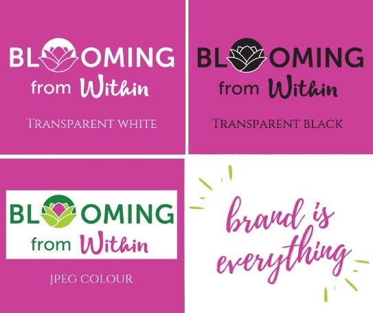
Have a main jpeg logo for your business card and email type links.


Then have variations such as white, black and transparent versions. This will enable you to always ensure every single thing that you produce. Note the colours used in the following graphics all incorporate my logo colours.
TELL YOUR STORY
I started working in my business as a massage therapist whilst simultaneously being employed by an international corporate consulting firm. The stress was through the roof and I had begun my personal transformation through taking my initial spiritual journey steps. Short version of my story was the realisation that I in order to change, I had to take responsibility for my ‘stuff’. I had to choose to change in order to ‘bloom from within’.
The flower within the actual wording of my logo is significant of the spiritual journey as well as the logo. The font for ‘BLOOMING’ is intentionally bold, and, intended to be a call to action. The font for the word ‘within’ is intended to reflect our individual uniqueness.
References
Philip Kotler/Gary Armstrong, (2017) “Principles of Marketing”, Pearson Education Australia.